
DLA PIPER
YEAR
2022
ROLE
Lead UX Designer
TEAM
Creative Director: Mande Gaffney
Lead UX Designer: Cathy Yang
Lead Visual Designer: Rachel Jeffs
Content Team: Scott Pierce (Lead), Dion Warrick, and Caroline Leader
PRESS

OUR CHALLENGE
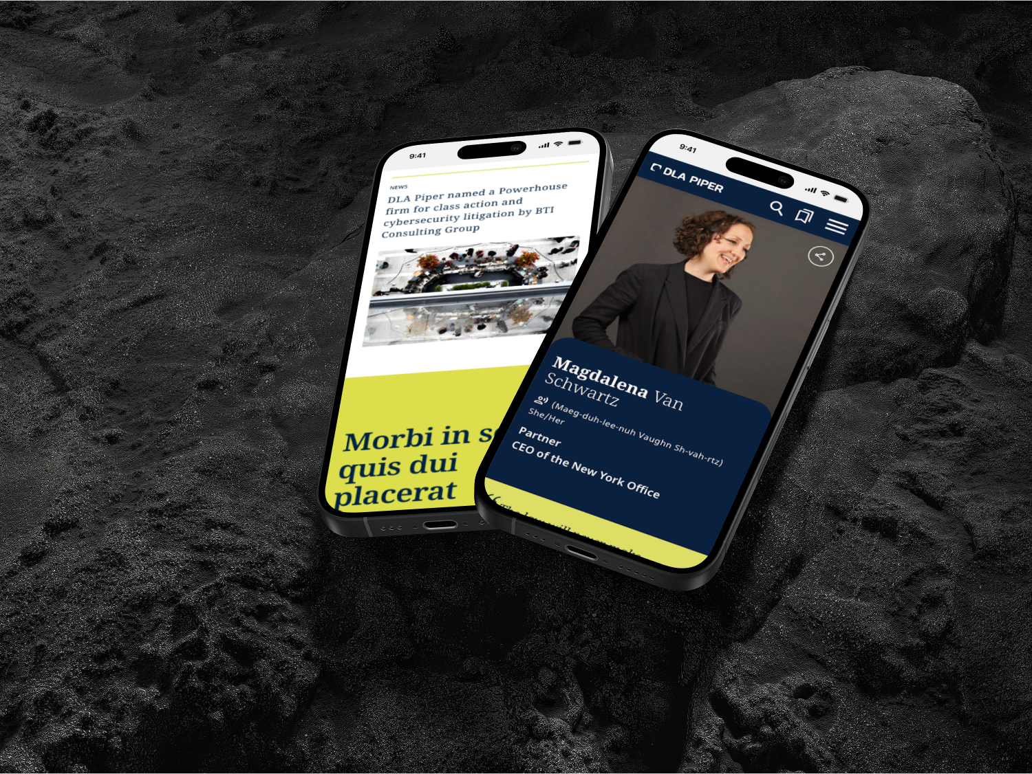
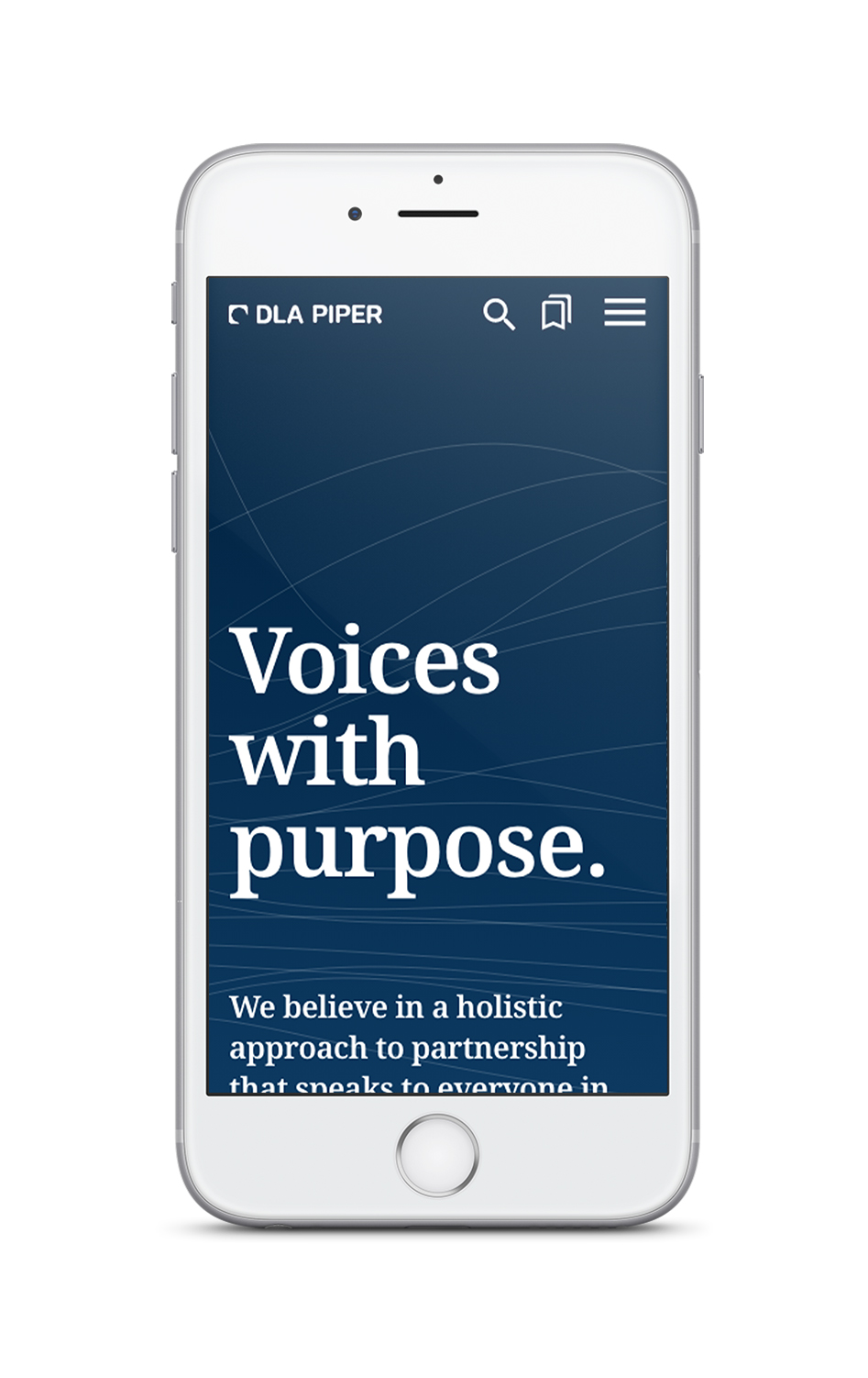
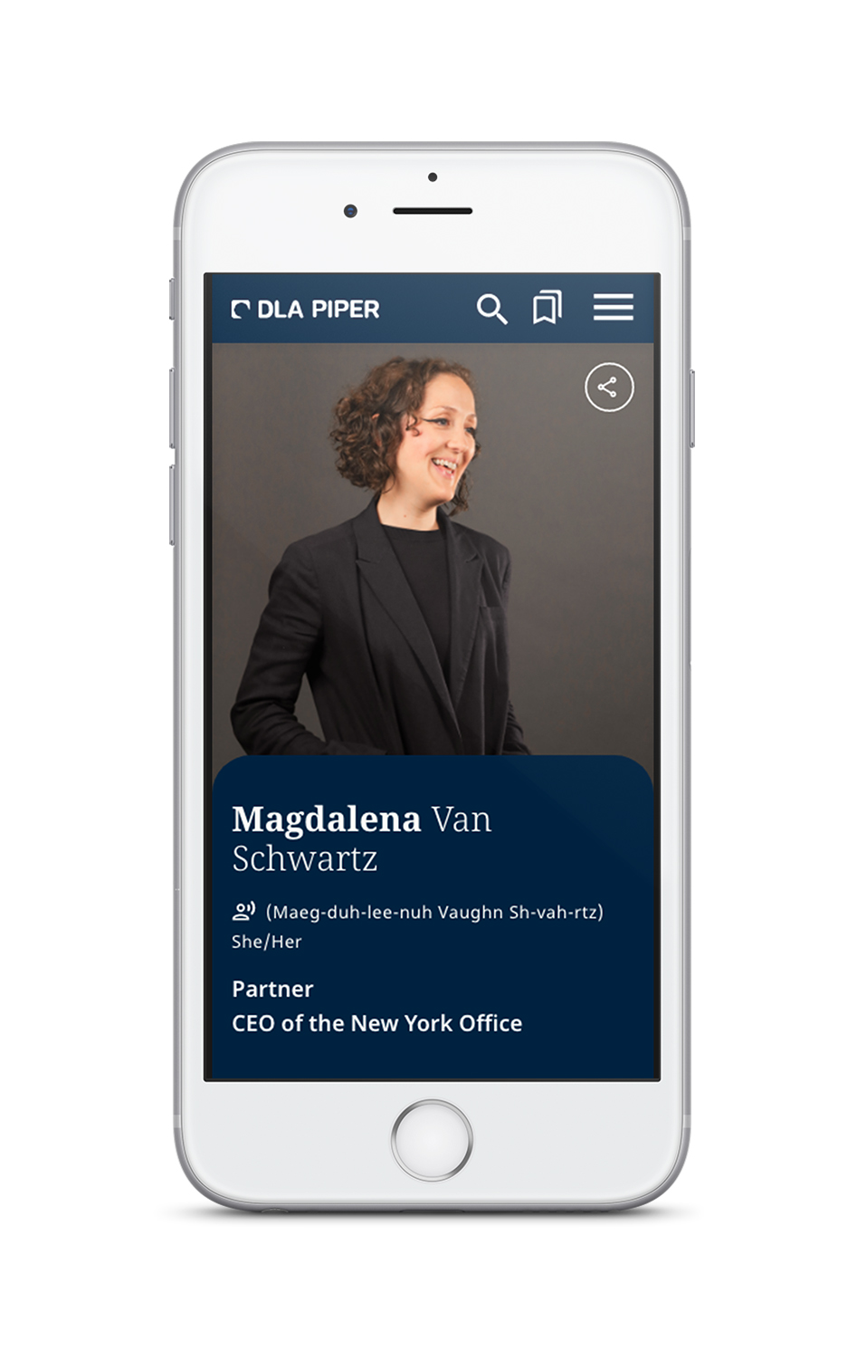
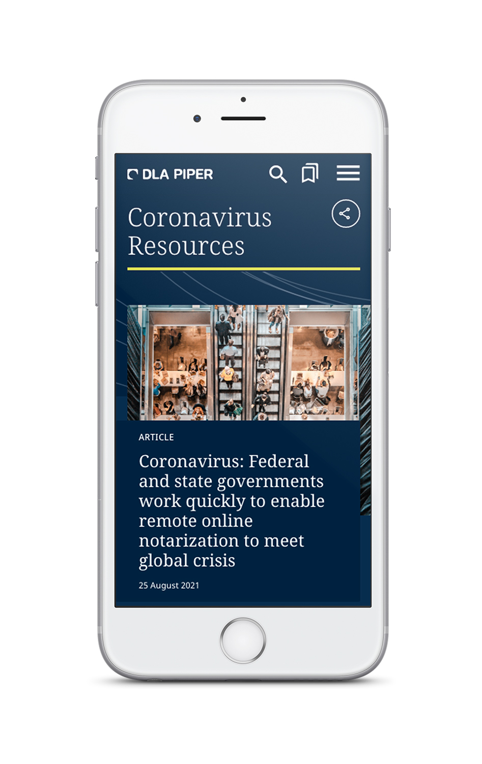
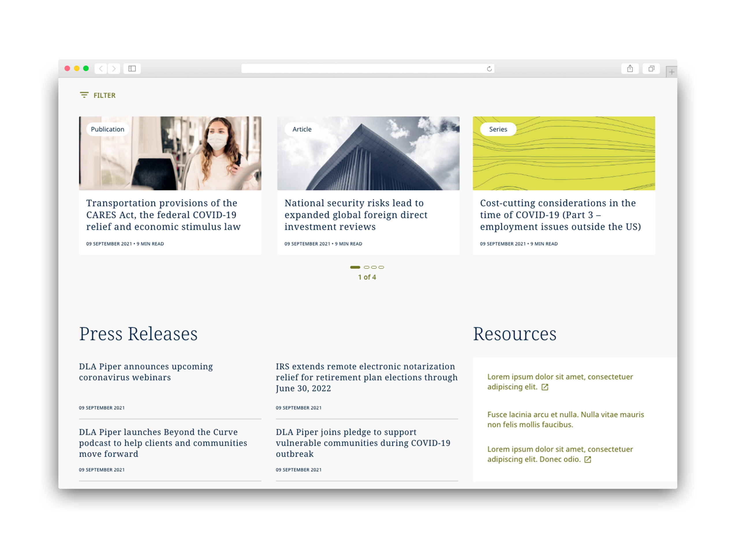
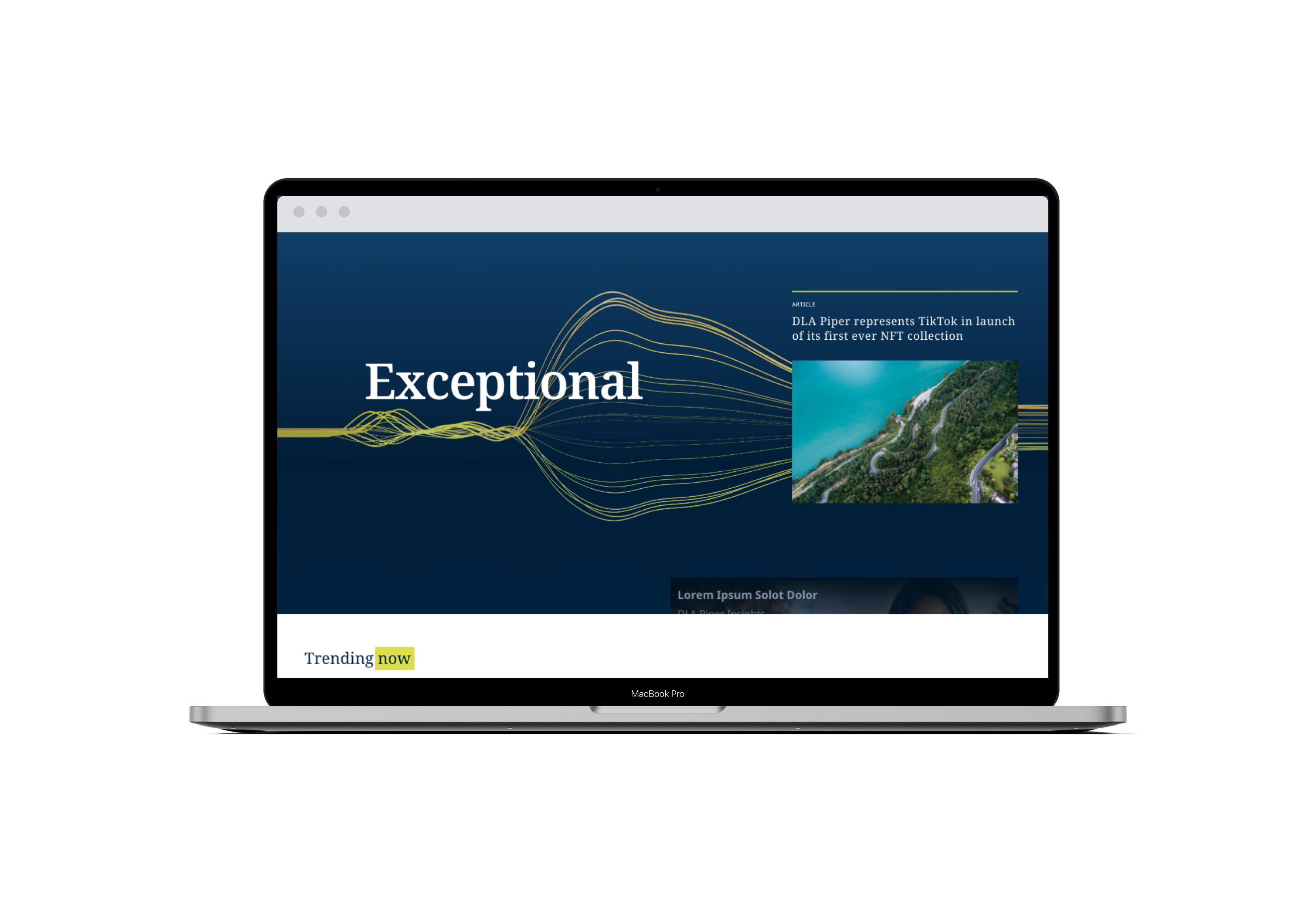
Our client came with a seemingly straightforward ask: How can we be more than just another law firm site? Their original site wasn't hitting the their needs anymore. We needed to showcase the lawyers' expertise across the many practice areas they had and find new ways to attract and convert potential clients in the digital space, especially considering the post-pandemic shift to mobile-first content.
"NOT JUST ANOTHER LAW FIRM"

PLAN OF EXECUTION
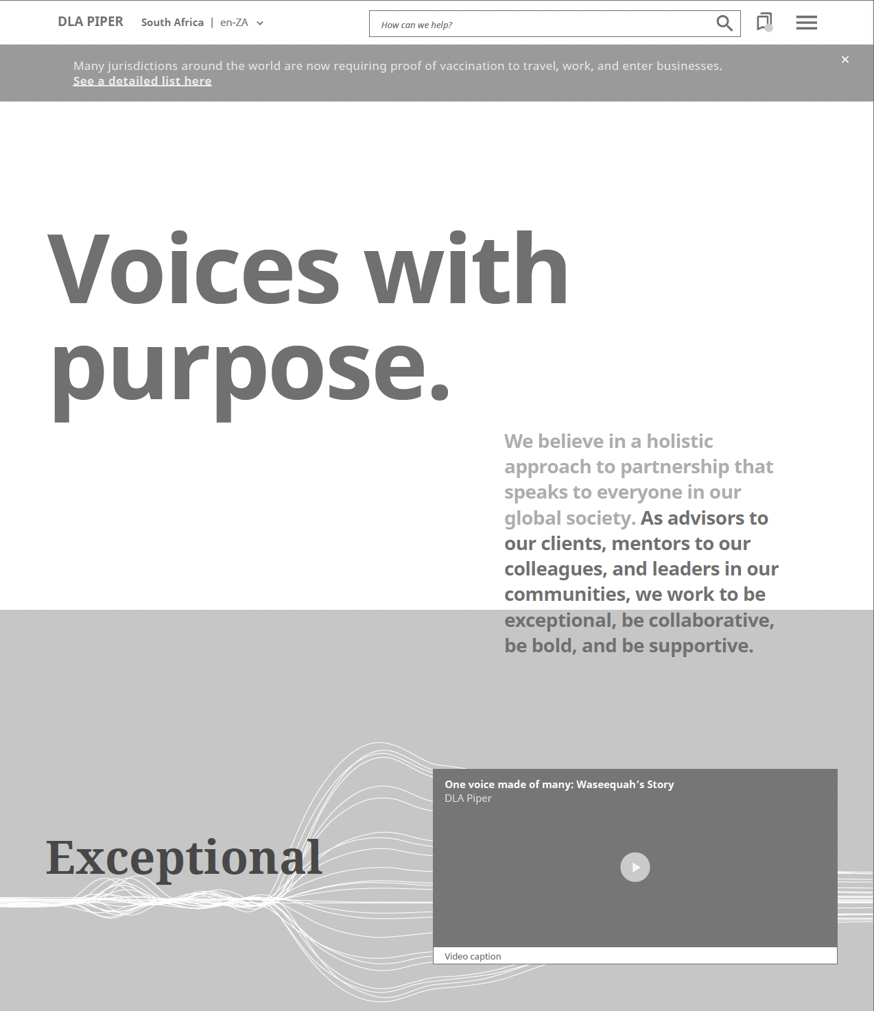
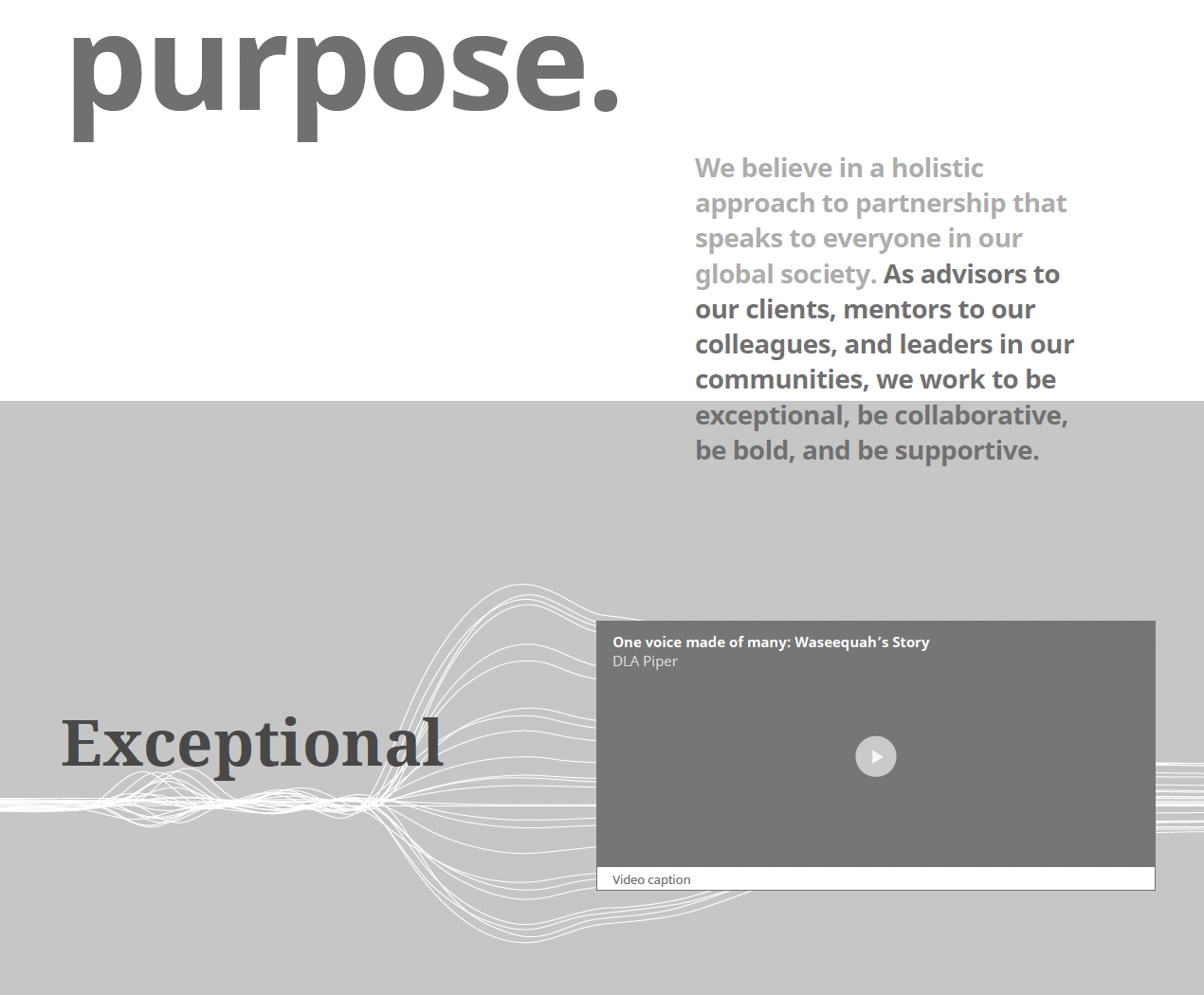
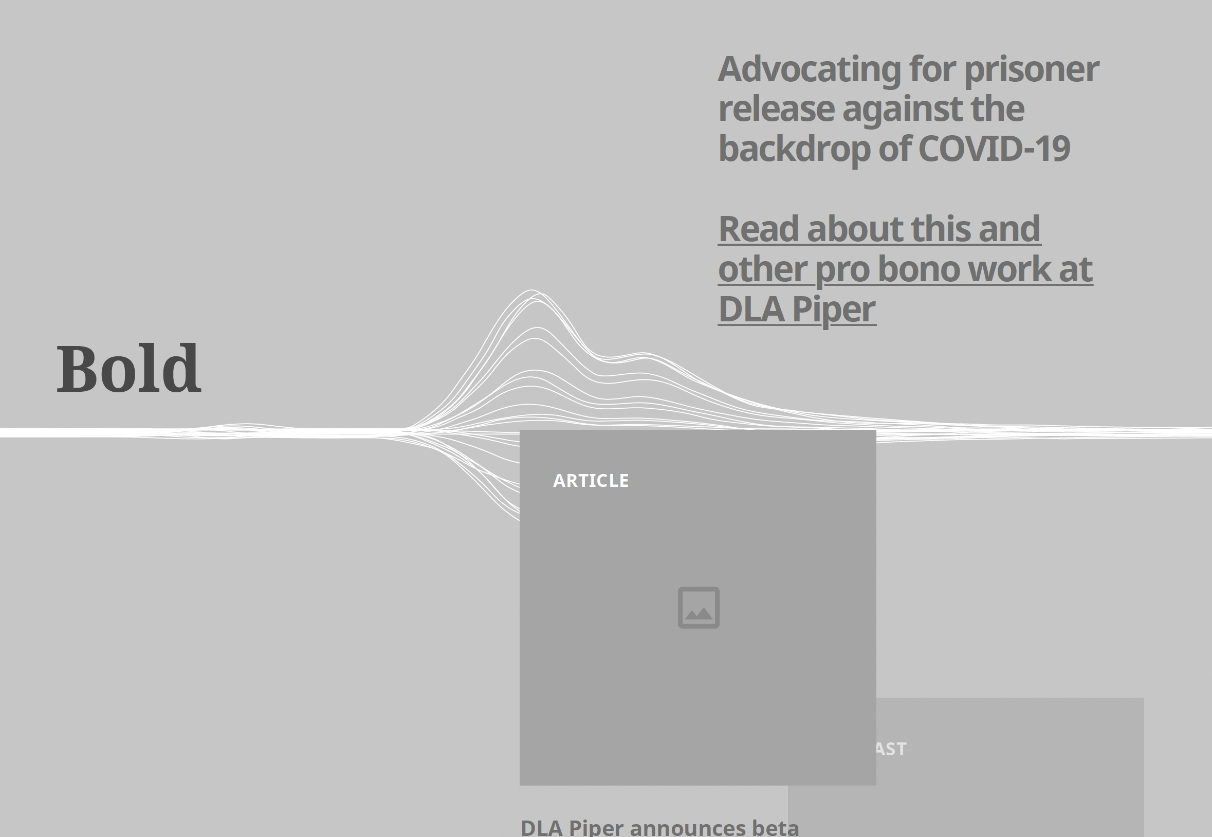
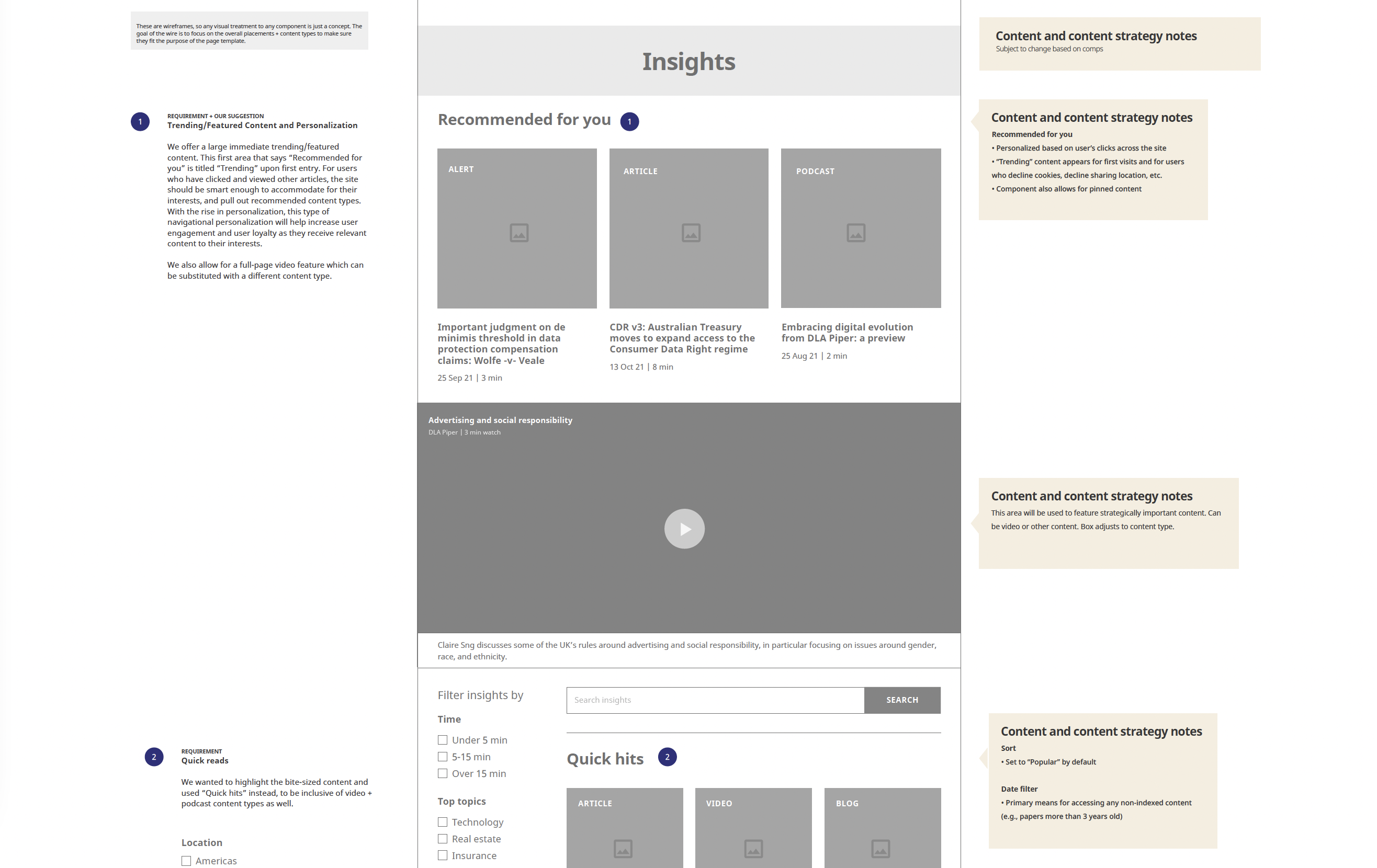
As the Lead UX Designer, I was responsible for bringing their vision to life by setting the blueprints of success - designing the overall structure and responsive wireframes of the site's revamp. This was a unique powerhouse team of design and content, where I got the chance to collaborate with our content strategists and visuals every step of the way to provide a united stance for client presentations.
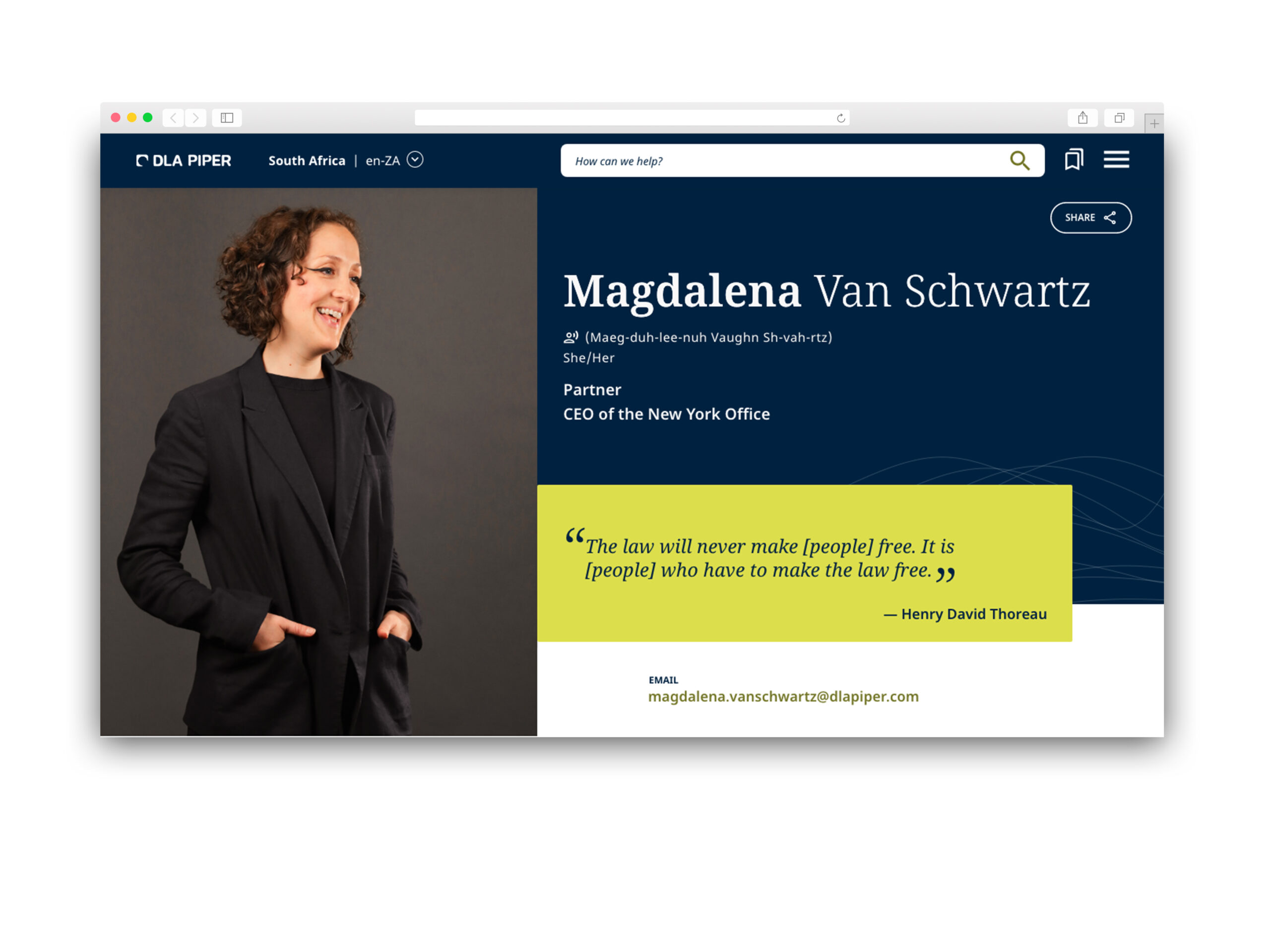
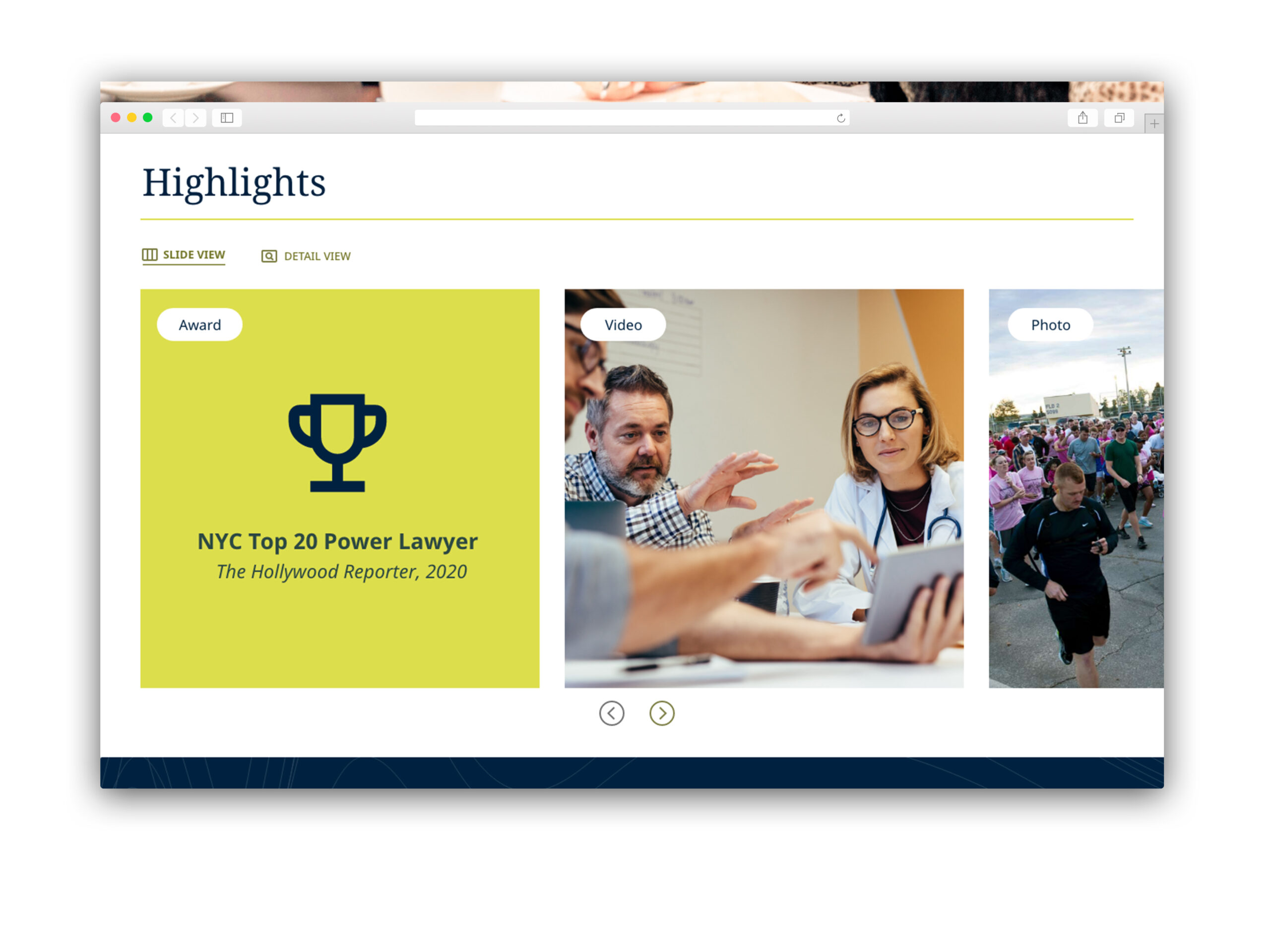
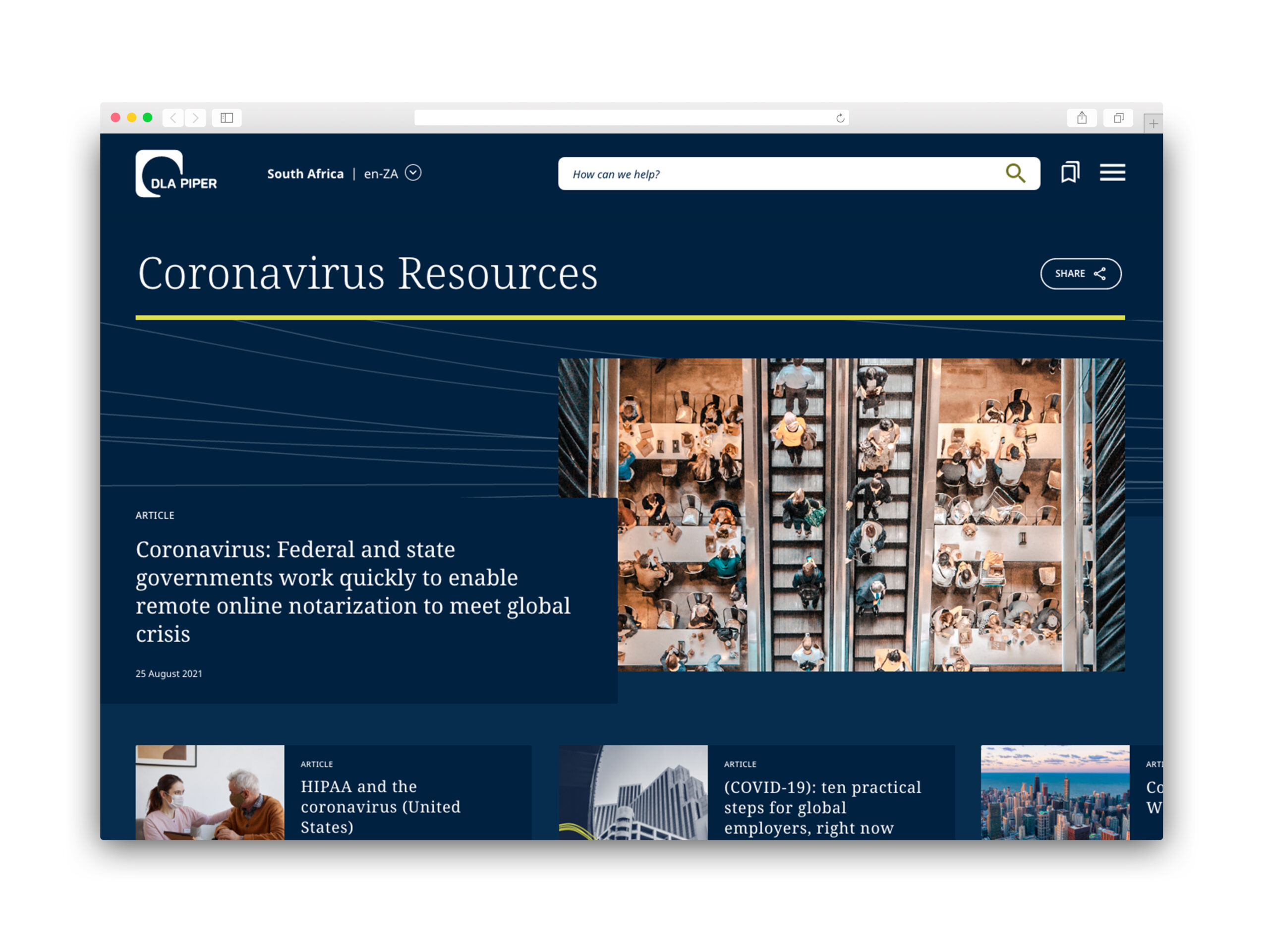
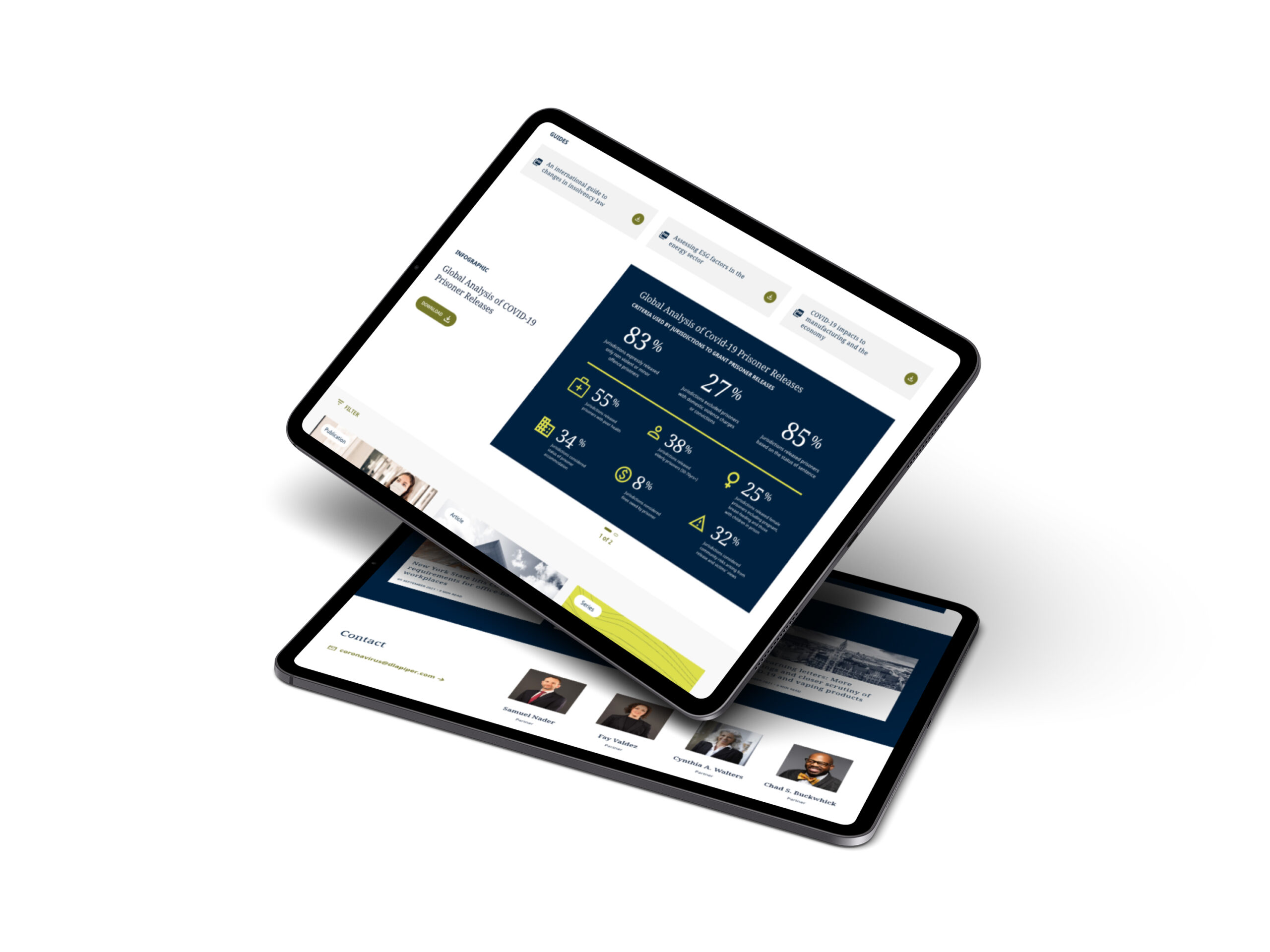
We came in with a plan to break down their safety net, and we were able to showcase an innovative concept that looked and behaved nothing like their competitors, while making their overall experience responsive, more user friendly, and accessible.
COLLABORATION IS KING
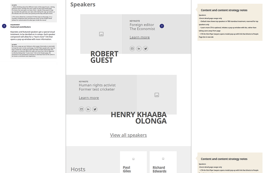
In order to satisfy the client's needs, wireframes became a lot more than just a wireframe. I learned quickly during my presentations that they needed to see the visuals, so instead of a very bare-bones wireframe, I was delivering quite high-fidelity ones that were close to one skin away from a visual comp. In order to pull this off, I needed to work closely with our visual and content team to come up with some of these incredible wireframes filled with copy in the suggested brand tone.
As you can see from the wires, there are notes on both sides (left being my UX notes and right being the content strategy for the pages) - we presented these to the client to show that we were thinking not just in silos but about the entire project as a whole.
CONCLUSION
Although our time with the client was limited, the impact of our work continues to show. Following the launch, early analytics pointed to a noticeable increase in mobile engagement—confirming that our mobile-first approach resonated with users. While we weren't able to stay on long enough to see the full evolution of the site in the wild, we left behind a solid, scalable foundation that reflected a unified design and content vision. More than just a site redesign, this was a strategic shift in how the firm shows up digitally—positioned not as just another law firm, but as a confident, user-first experience built for the modern client.
"Big law made the list of creative websites, we’ve truly entered the modern age. DLA Piper – an AM Law 100 firm – made a shockingly good impression with their dynamic website. In an ecosystem notorious for stuffy sites with boilerplate design and uninspired copy, DLA Piper stands out."
Based in Atlanta, GA.
©2025.